Conversations workshop
https://pad.vvvvvvaria.org/WttF.The-Ecosystem-is-Moving.worksession
Implementing conviviality in multi-user chat environments
On Saturday the 2nd of June, Varia held a work session around the digital interface design of the federated chat client Conversations together with its developer, Daniel Gultsch.
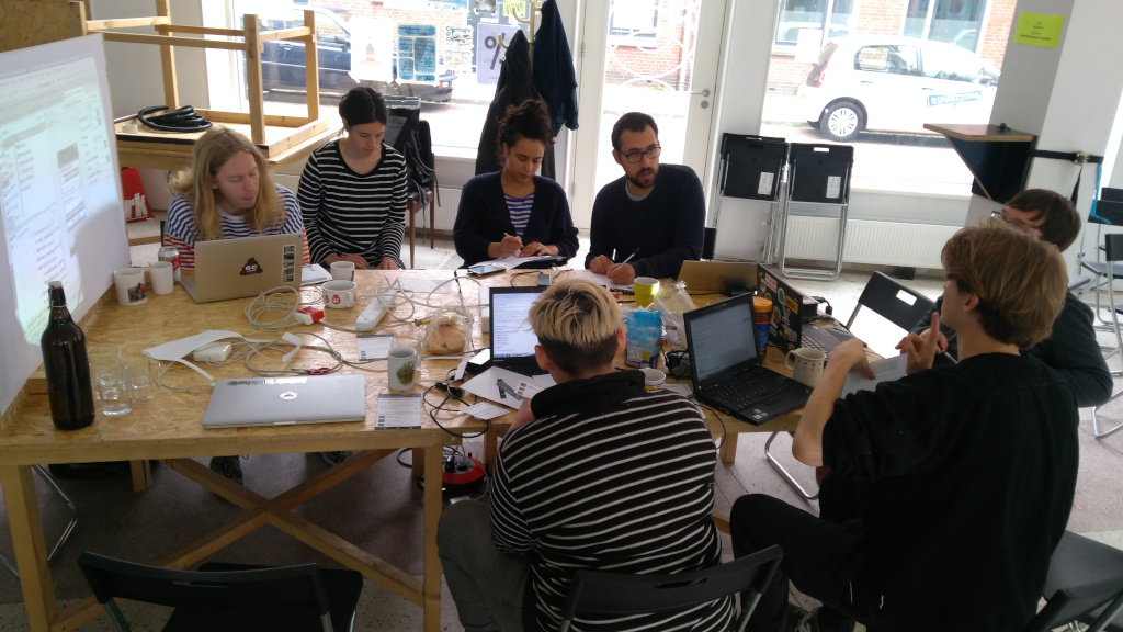 Work session, Saturday 2 June
During this day, we focused on the group chat interface as a key element for sociality afforded by the XMPP protocol. XMPP stands for Extensible Messaging and Presence Protocol and has its roots in the Jabber community. The protocol emerged in 1999 as a decentralised, secure and open alternative to commercially-driven instant messaging services and included specifications for various types of XML data exchanges. Two of them are one-to-one and many-to-many instant messaging, the latter being also called MUCs (multi-user chats). Since then it has undergone several transformations, but the key elements have remained unchanged.
The history of the protocol and commitment of the community behind it have informed the current design of the Conversations client; some of the terminology, for example “roster”, is still being used.
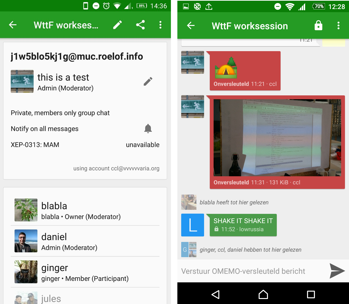
We started by listing all of the features of the user interface design:
At the top of the phone screen, the room name that was configured by the room owner is shown. If the group doesn't have a name, it will be assigned a combination of the nicknames of the participants.
Below are the room ID of the group chat that is randomly generated by the Jabber server, thus often difficult to read for users, and information about the user: the avatar, their nickname and their role within the chat.
What follows is the room roster, the client's representation of the list of occupants, described by their names and their nicknames for the particular session. And at the end of the list is a button to invite new members into the room.
MUCs can be of many types:
- public vs. hidden
- persistent vs. temporary
- password-protected vs. unsecured
- members-only vs. open
- moderated vs. unmoderated
- non-anonymous vs. semi-anonymous
For example, group chats can be non-anonymous or semi-anonymous, depending on whether the full Jabber IDs (JIDs) of the members are visible or not. Considering that some of the groups have several hundreds of participants, the ability to hide one's full Jabber ID is very handy. Nonetheless, it will still be visible to the group owner and administrators.
Groups can also be split into members-only and open. Based on this setting, the group determines who is allowed to join the chat and how easy it is to find through search.
Most groups on XMPP are: Members-only and non-anonymous Open and semi-anonymous
A MUC user – or what the XMPP protocol calls an “occupant” - can have multiple affiliations: owner, member, administrator, none and outcast.
An owner is in practice only one, the person that created it. An administrator has similar rights as those of the owner, but without the possibility to make other occupants adminstrators, to change the group configuration or to destroy the room. A participant has the right to participate in the conversation, as opposed to visitors (no affiliation), who can only observe. Lastly, an outcast is a user which has been banned from a group chat.
There are a few design qualities that make Conversations stand out from other commercially-driven alternatives, such as Whatsapp or Telegram. For example, there is no indication as to when a user was last active. Presence is a matter of debate within the XMPP community: while Conversations has chosen not to display the availability of a user in individual chats, the implementation has made its way to the group chat as a result of popular demand.
In order to understand other ways in which it differs from alternatives, we looked at a collection of chat clients to compare their group chat affordances.
Signal
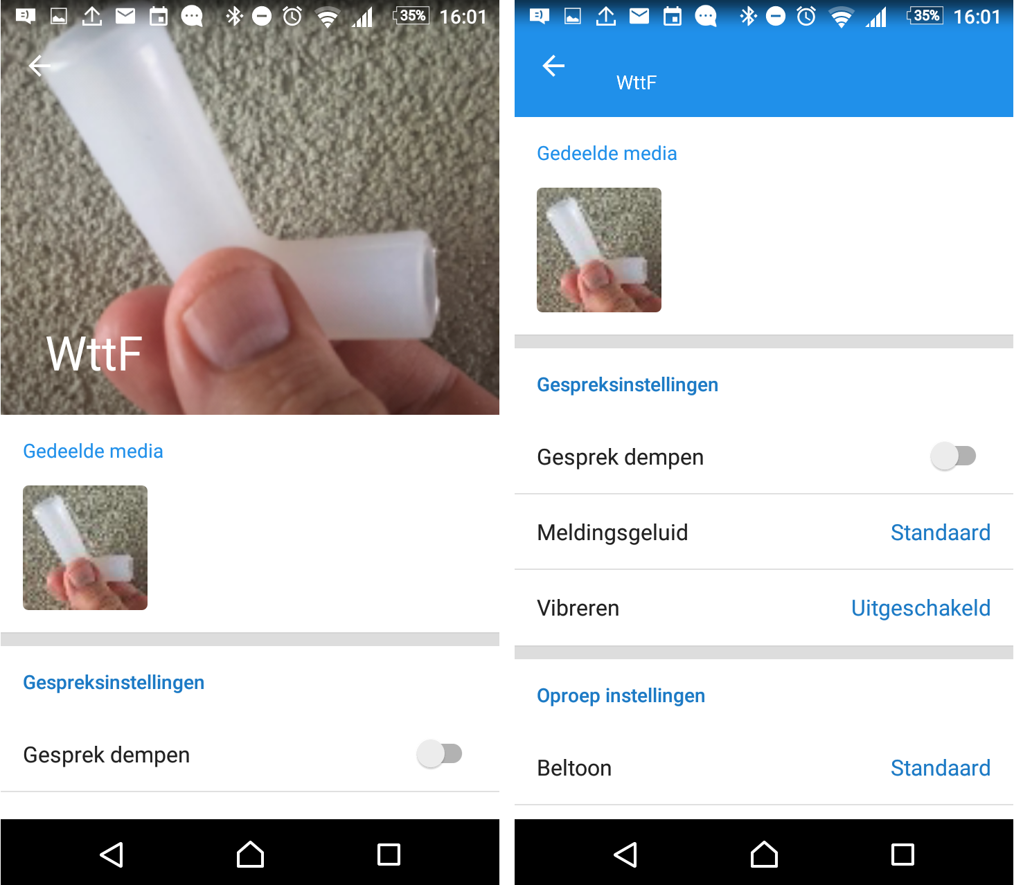
The group chat banner takes up a high percentage of the screen, there is a section for shared media, you can mute group chats, or set the ringtone/vibrations settings for notifications. The current members are displayed in a list without avatars: since Signal is based on a person's phone number as an identity, it doesn't need to give a lot of descriptors.
Telegram
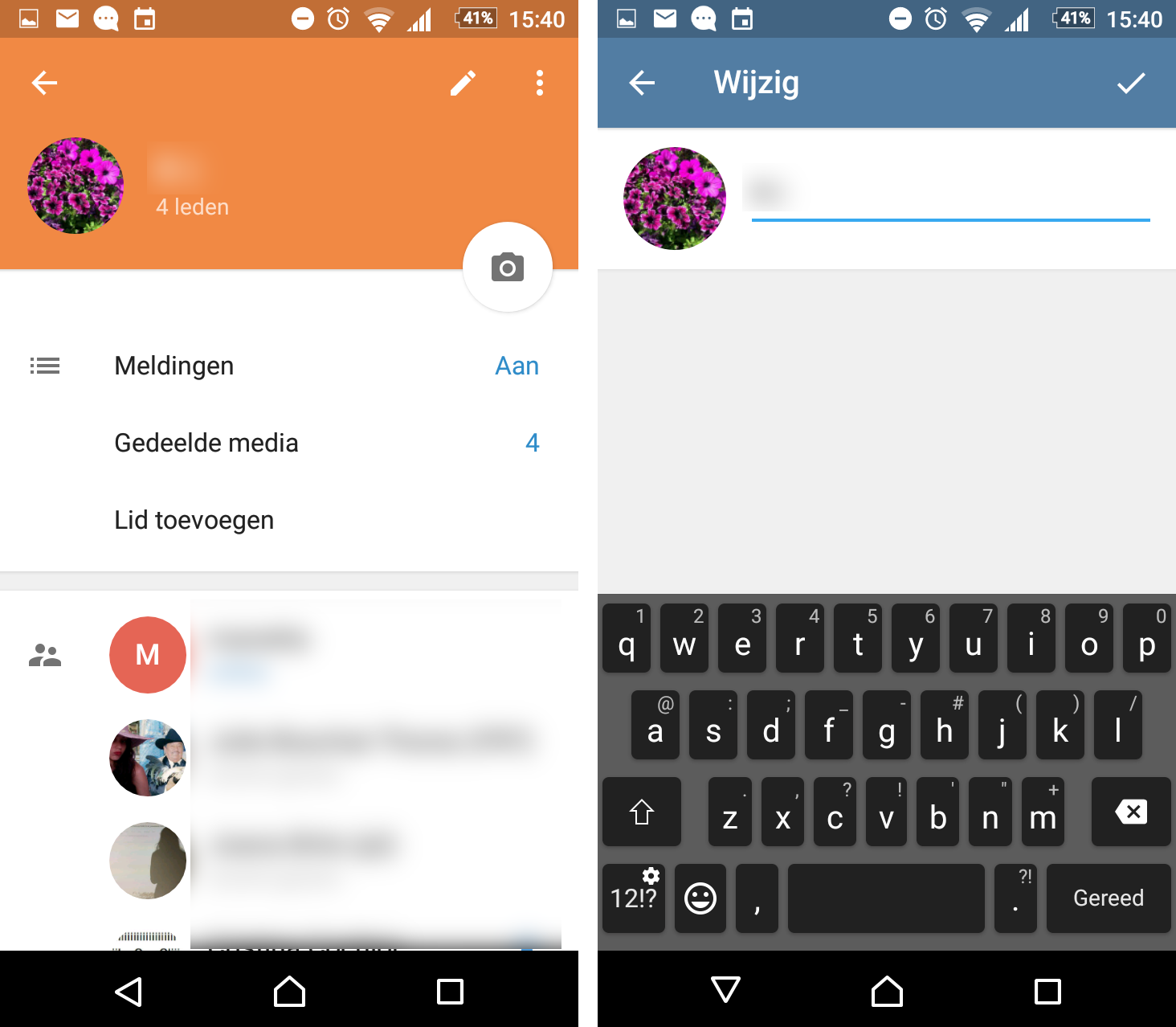
You can change the name and the avatar of the group chat. (Currently, the group avatars in Conversations are generated from some of the members' avatars. It isn't possible yet to add one.) The menu includes options such as: edit, find members, remove group, abandon group and add a shortcut. The last function adds a shortcut to the group on the desktop. Below that are settings for the notifications, a shared media section, add member option and at the bottom is the list of current members. In order to indicate who is the owner of the group chat, Telegram adds a star to the person's name.
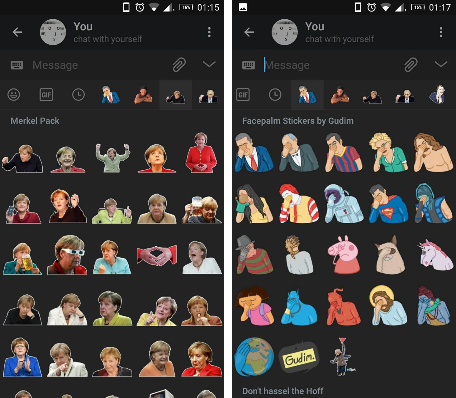
Another important feature are the sticker sets on Telegram. Users have the possibility to upload their own images that are then made available to anyone else using the app. The sticker sets have become one of its most appealing functions, leading to a quite a large variety in subject choice and tone of humour that is all conjured by the users.
Facebook Messenger
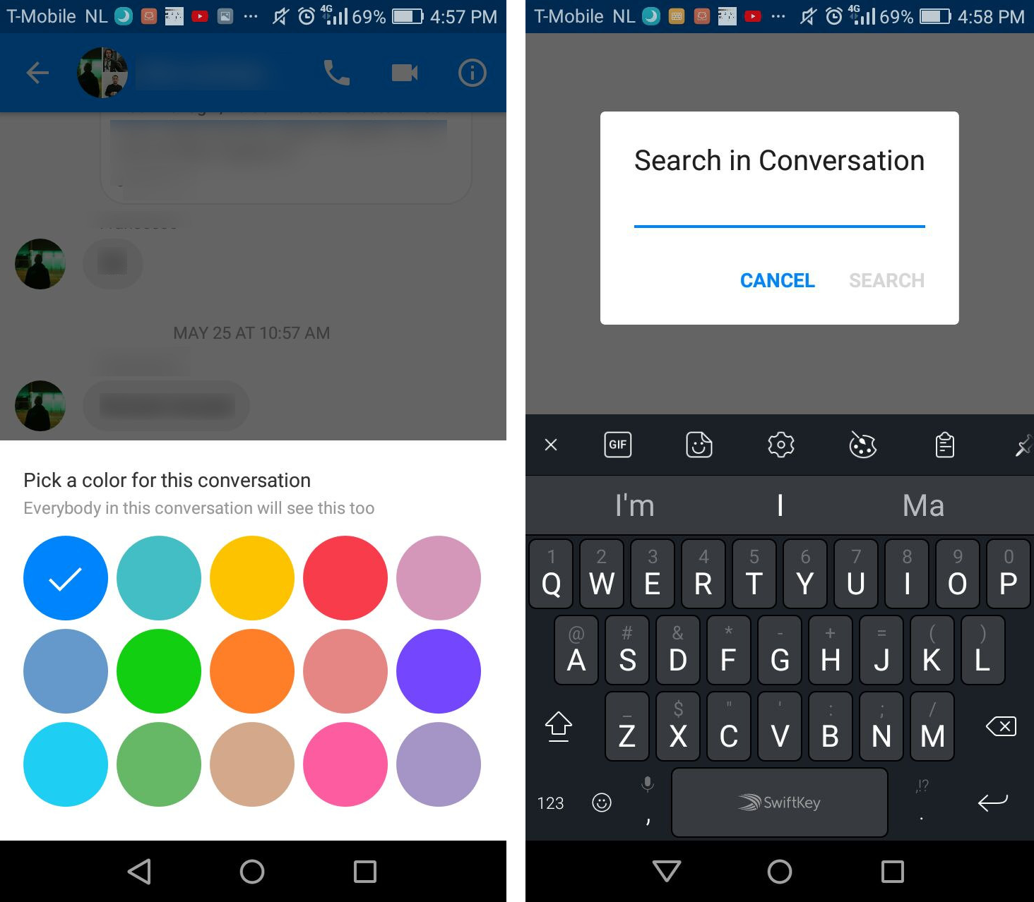
Facebook Messenger has many options for personalisation: Color, Emoji, Nicknames, Search in conversation. Some of these functions are convivial in nature, for example, the nicknames are not a necessity, but they add a feeling of informality within the group. Although they may seem frivolous, these features contribute to the atmosphere of the chat. In contrast, Conversations is following the tradition of XMPP and IRC chats, which are most often used by developers. As a result, efficiency and privacy are some of the core values of the app. But considering that default settings change depending on whether you are in a public or private group, this can be altered.
Our task for the day became to consider ways in which we can introduce a sense of intimacy into the app's group chat design: how to pay attention to features that are often considered “silly”, but make a space feel more homely; how to implement conviviality.
Facebook Messenger puts a lot of effort into the features that make a group chat more hospitable: being able to give nickna mes to your friends, change the colour of the chat, or select an emoji for the conversation.
Another interesting design choice we observed in Messenger is to have the options categorised and displayed into subscreens, which could be implemented into Conversations as well. The clunkiness and length of the list of options is also the reason why Daniel has not yet implemented Search For Words in the conversation, despite the fact that it wouldn't be a technical issue.
Conversations has been making similar attempts, but in some of the situations it faces technical challenges. For example, it is difficult to choose a banner for the group, because of the technical restriction on the image sizes. Traditionally, each XML packet in XMPP has an upper limit of 10.000 bytes. Despite the fact that many servers have increased this number, one shouldn't assume that all of them have done so. It would be possible to reach an agreement to raise the upper limit, but this is a consensus that must be reached among thousands of servers. Until then, the default size of the image is 196x196 pixels in Conversation (extended from the usual 64x64 pixels), a size that can be read by all XMPP servers with which a user makes contact.
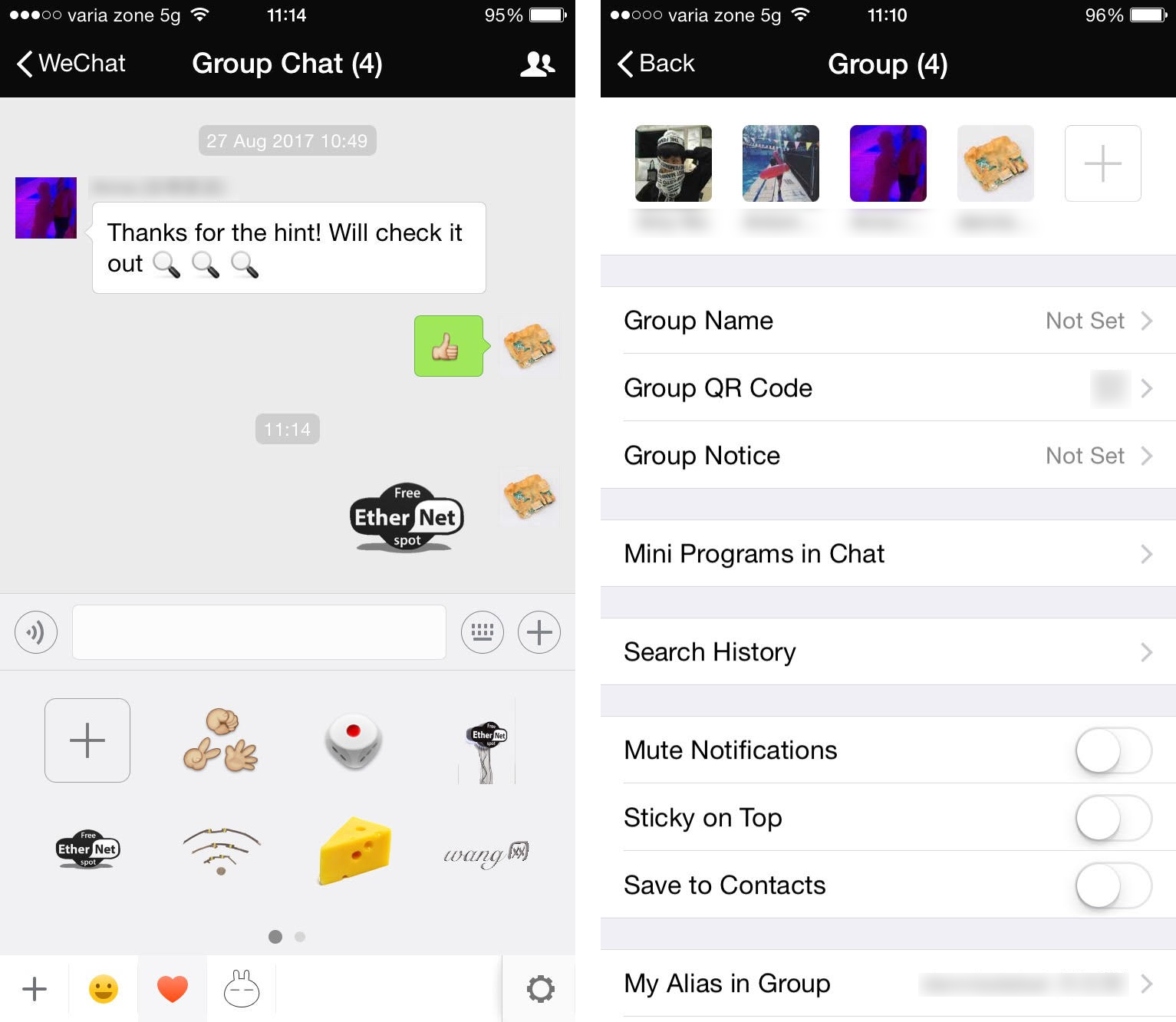
WeChat is a Chinese chat application. The group chat interface has a few functionalities that are particular to itself: for example, you can subscribe to feeds of group members, you can pay them, search for people from your contact list that are nearby, or you can make your own emojis within the application by uploading the images directly into the chat – the application will do the background detection and removal for you.
In WeChat, private group chats can be accessed by entering a four digit code and having the GPS activated to check that one is in the vicinity of the other group members.
When looking at the group members list, it was interesting to observe that WeChat shows each participant's avatar above their name and turn each participant into an equally-sized block.
Other options that stood out included: Clear Chat History and Delete and Leave.
Conversations interface, the group chat info view
After going through the different takes we continued the afternoon by redesigning the existing Conversations group chat interface.
We defined the user scenarios in which someone would arrive to that page as being: Wanting to add a new member, Wanting to remove a user, Wanting to proomote a user to an administrator, Changing your own notification settings, Changing name, avatar, subject, nick Seeing who's part of the group, Knowing which specific account you're using for the chat, Sharing the group by creating QR codes.
Below are some of the observations and the mockups that the participants came up with:
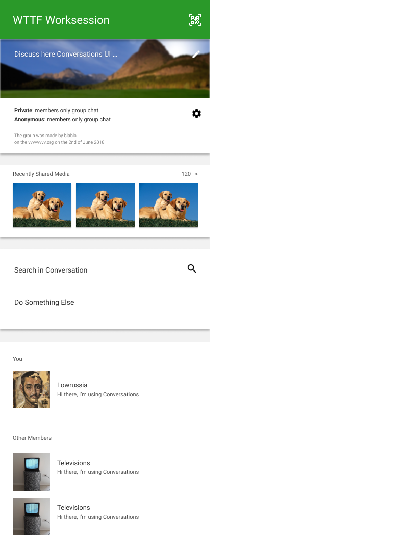
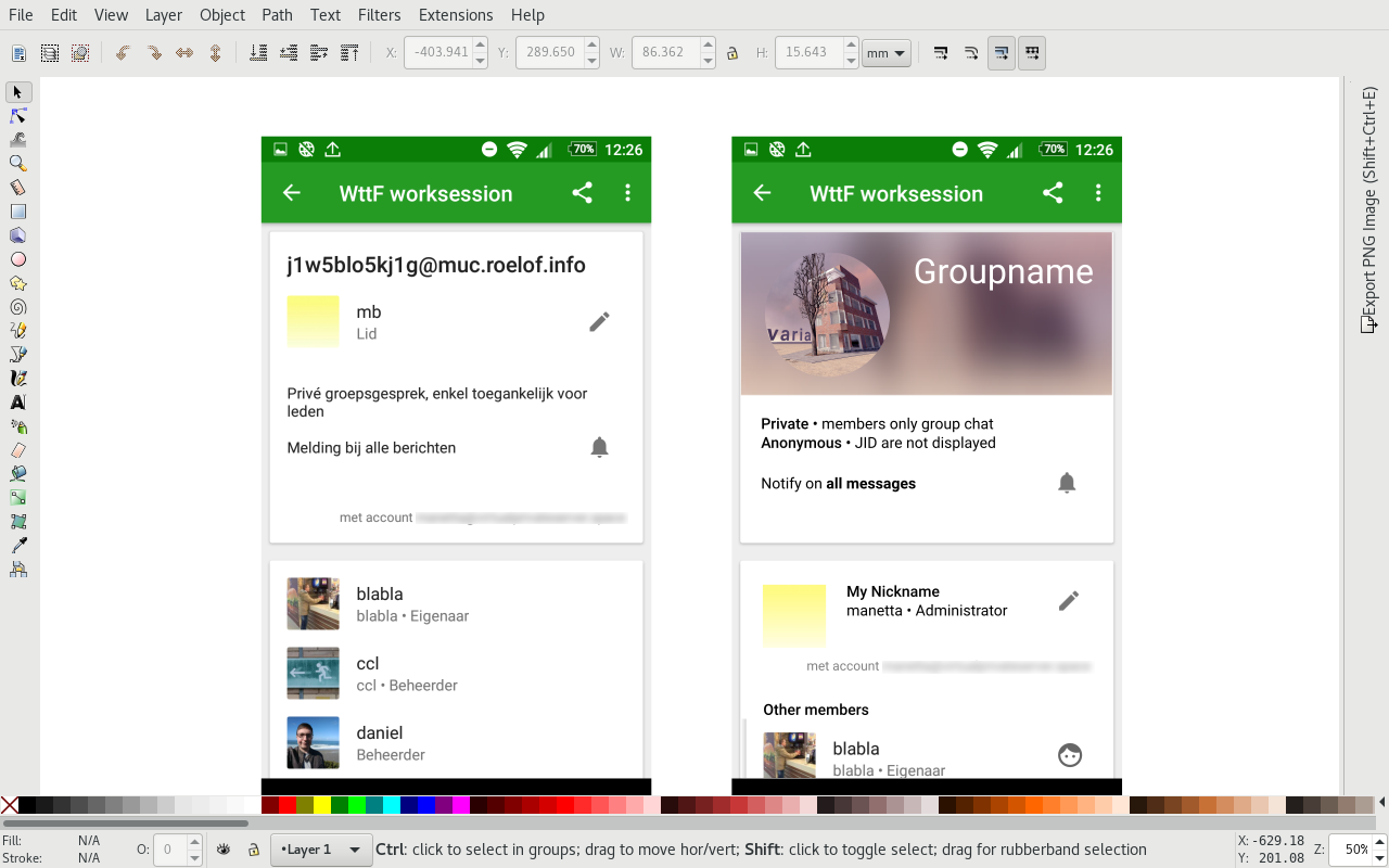
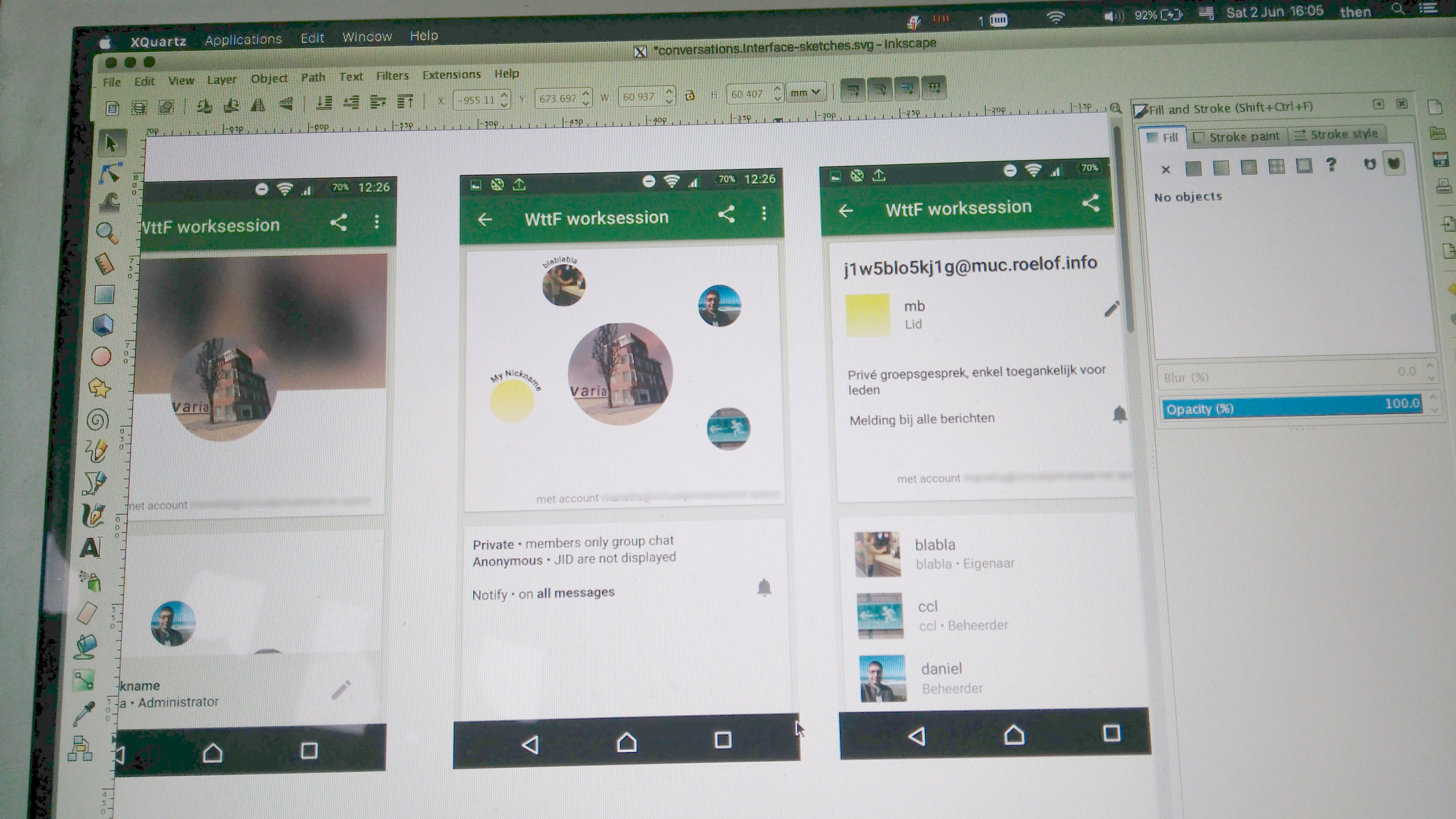 Adding banner images for MUCs. Considering the technical limitations that the images are subject to, the banner could be composed of a different rearrangement of the user profile pictures, or it could be a blurred expanded version of the profile picture.
Many of the workshop participants' efforts went towards creating a distinct identity for the group chats. Attention was given to the order in which the participants appear: the user who's viewing it can be shown first, but there should be no hierarchy between the rest.
 Another suggestion was to use a blurred version of one of the profile pictures as banners.
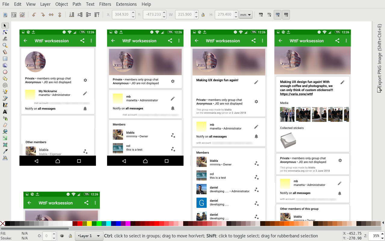 One of the suggestions was to separate the menu into relevantly categorised options.
 Many of the ideas seemed to reverberate around the room. Other participants also suggested to use a different model to the list in displaying the members.
 The action of long tapping as a way to access functions was brought into question as it may not be an obvious route for everyone. Removing the role of the speaker from the list leads to a less hierarchical read.
 Regrouping of the options list.

 One design proposal flipped the perspective from that of a developer to that of a general user.
All of the participants approached the group-indentity-forming aspects of the design: shared media, avatars and banners the group, or pinning messages to the top of the group chat.
Final outcomes:
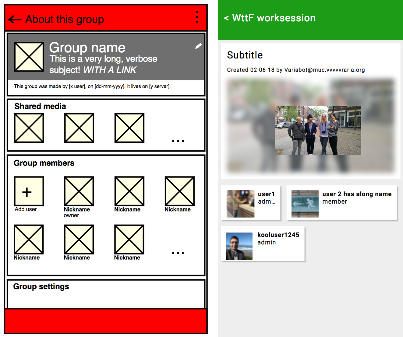
The final outcomes cater to the perspective of the general user over that of an administrator or an owner. By attempting to use formats that overcome the hierarchy of the list, such as grids, the participants made tweaks to the design that create context around the group beyond the technical information: what is the group for? Who is part of the group? What do they share? What is their humour like?
